


BeanBANG Bean to Bar Chocolate Visual Identity and Packaging
Overview
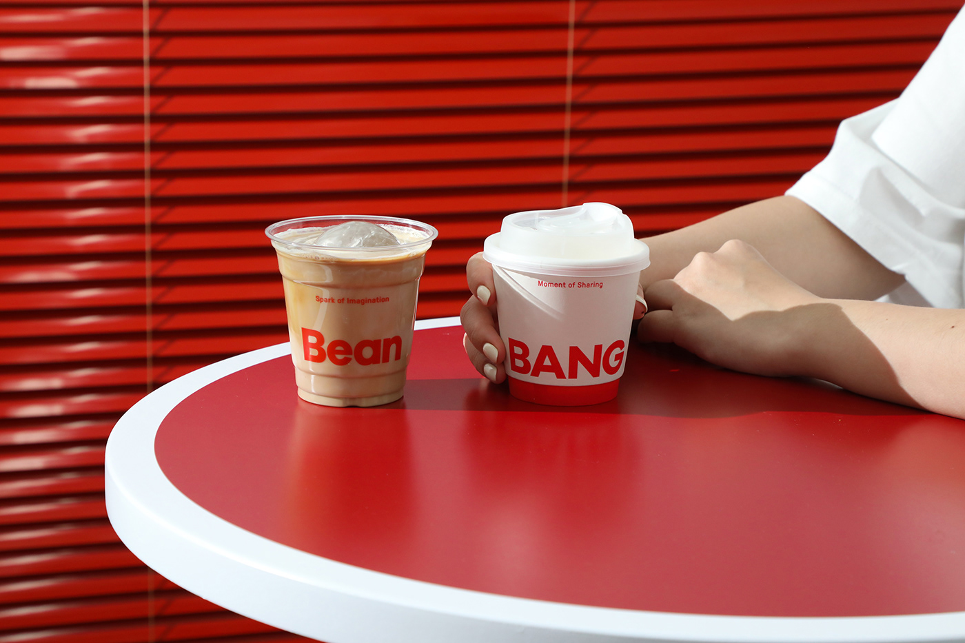
BeanBANG是一个集合咖啡与烘焙的精品巧克力品牌, 为大众带来极具想象力与创造力的全新味蕾感受。BeanBANG,「Bean」是生长在世界各地的咖啡豆与可可豆,「BANG」是物体碰撞时发出的声音。如名字所诠释的那样,这是豆与豆之间的碰撞,迸发具有想象力的独创风味。在风味中,享受精致的款待与分享的时刻。 同时,在BeanBANG不仅仅只有风味, 还有人与人之间的碰撞。在每一个日常的往来与分享中,我们碰撞想法,交换灵感,产生新的连接。
BeanBANG is a bean-to-bar chocolate brand that combines coffee and bakery, introducing imaginative and creative new taste experiences to everyone.BeanBANG combines "Bean," representing coffee and cocoa beans worldwide, with "BANG," evoking the sound of collision. By exploring the unique flavours of cocoa beans,BeanBANG hope to bring us a spark of imagination and a moment to share.
Design Concept
“碰撞实验室 Bang Lab”作为设计概念,从“分子球体碰撞”的物理实验汲取灵感,用“味蕾碰撞,迸发灵感。”定义品牌SLOGAN。在BeanBANG,有创造力的产品研发,严谨的配方调配与精细的制作工艺,都是为了让美好的风味因子碰撞。
The design concept, "Bang Lab," draws inspiration from the physics experiment of "molecular collision," defining the brand slogan as “Bang into inspiration." At BeanBANG, the focus is on creative product development, precise formula blending, and meticulous craftsmanship—all aimed at letting the diverse flavor elements collide.


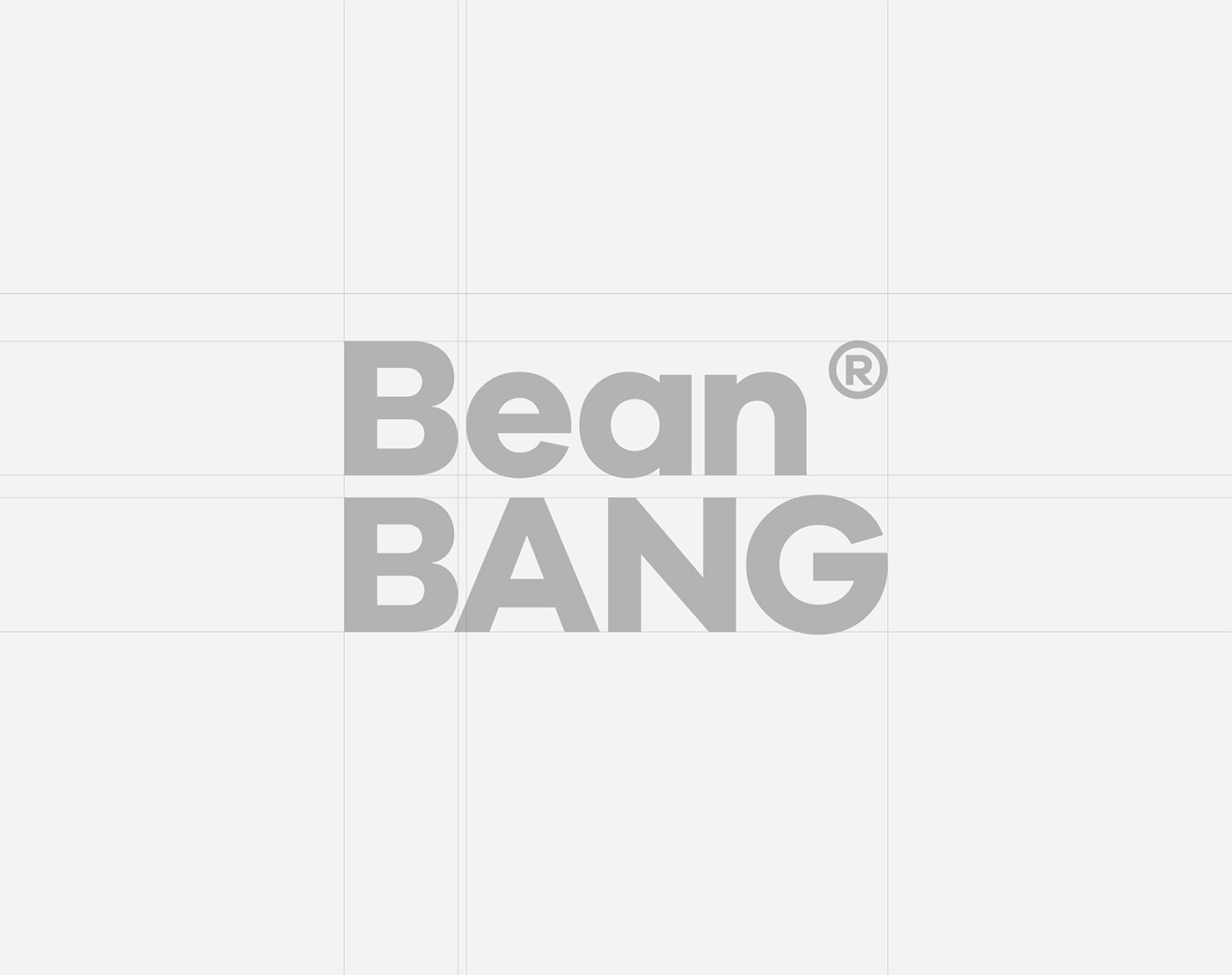
Logo
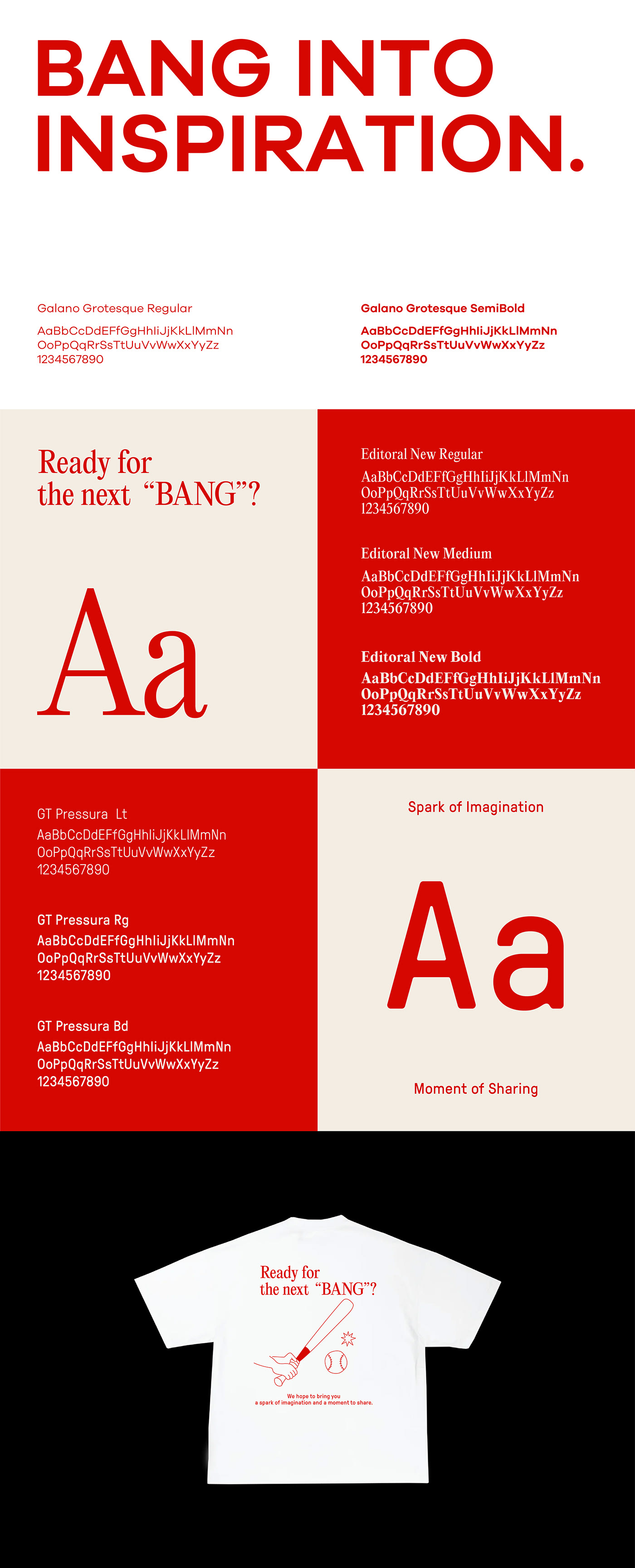
以“圆形球体”作为概念延伸,选用兼具几何感与现代简约的无衬线字体Galano Grotesque设计品牌英文Logo。
辅助Logo的图形依据来源于当两个“分子球体”发生碰撞时所产生的火花。在BeanBANG的视觉系统里,此辅助Logo寓意为“灵感火花”或“超出预期的惊喜”。
The English logo use the geometric and modern sans-serif font Galano Grotesque. The auxiliary logo draws inspiration from the sparks generated when two "molecular spheres" collide, defined as the "spark of inspiration" or "unexpected surprises."
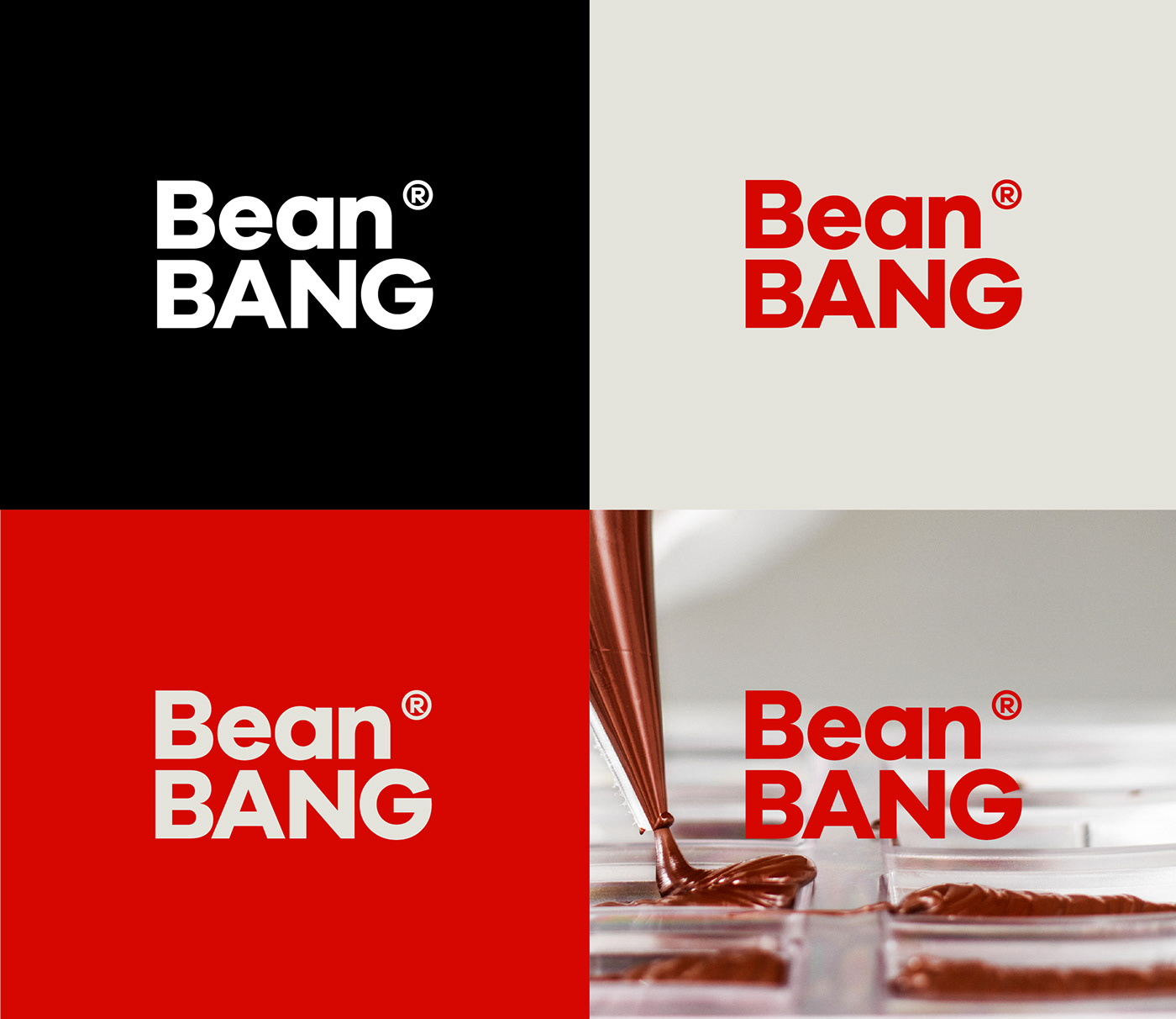

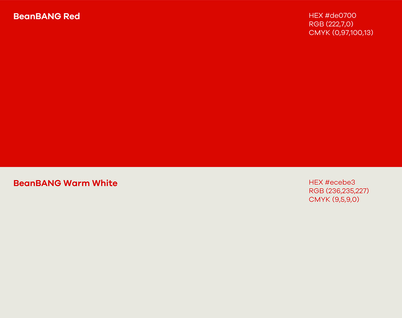
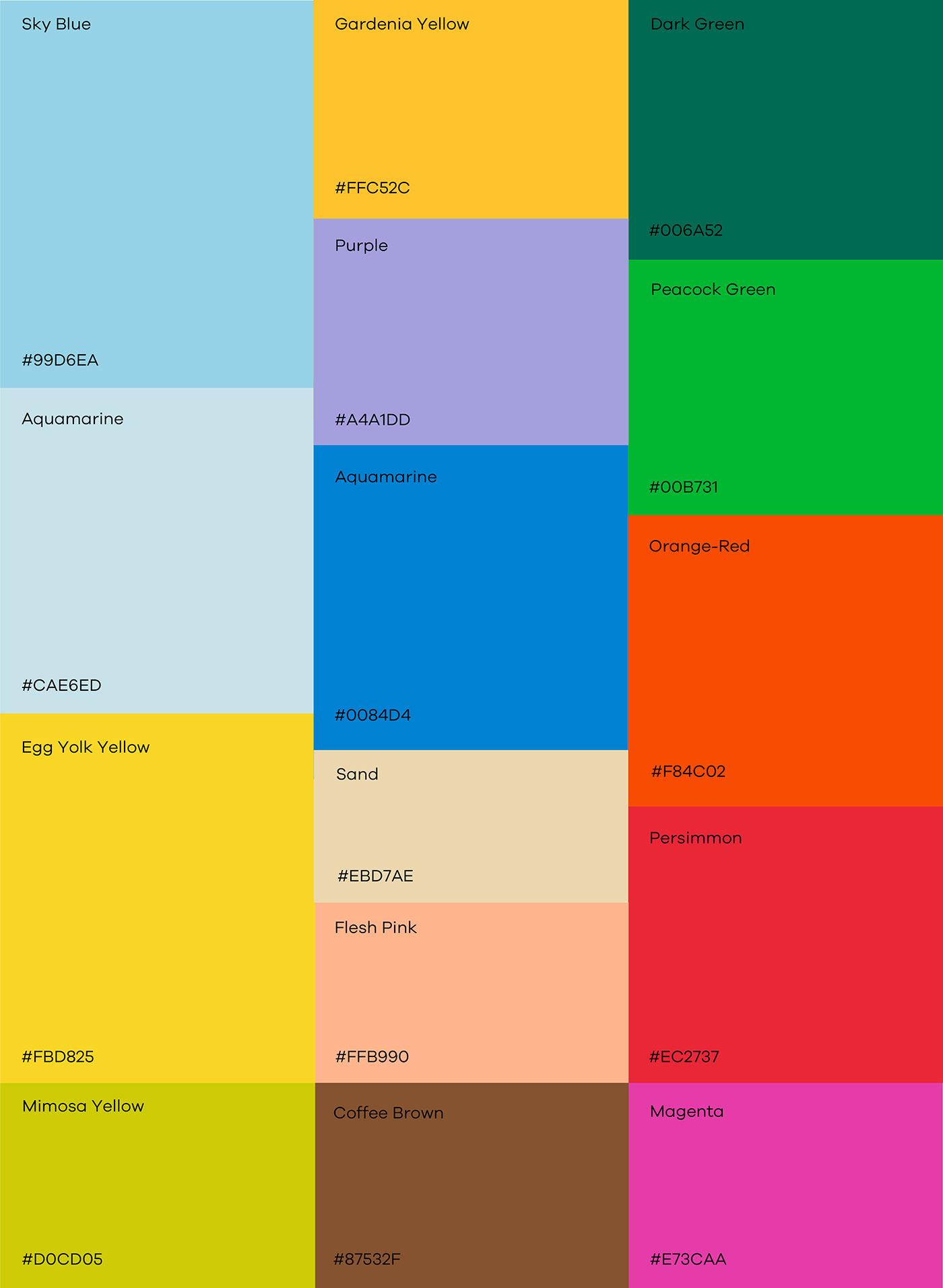
Color
当两个分子球体碰撞时迸发出能量,因此,将红色定义为品牌主色,同时红色代表着热情、关切、爱意,它能够代表BeanBANG希望给予大众的能量与积极向上的生活态度。在辅助色彩系统里,我们通过丰富的色彩碰撞来展示来自世界各地的可可豆风味。
When two molecular spheres collide, energy bursts forth. Hence, red is chosen as the main brand color, symbolizing passion, care, and love. It embodies the energy and positive life attitude that BeanBANG aims to bring to the everyone.In the auxiliary color system, a rich palette symbolizes the collision of cocoa bean flavors from worldwide.


Typography
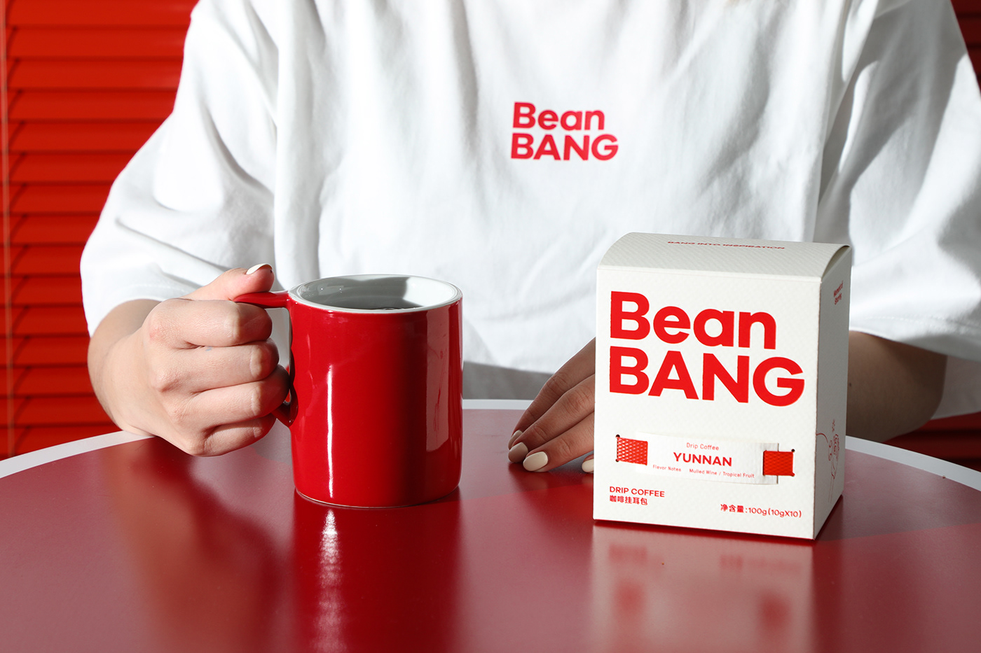
Editoral New作为装饰性英文字体被应用在品牌周边产品的字体排版上,它具有优雅、精致、现代的字体气质,能够让BeanBANG的周边产品设计更显时髦。GT Pressure为另外一款英文装饰性字体, GT Pressure拥有工业打字机、实验室的字体气质,因此它将被用于品牌包装的标签设计排版中,让产品更显专业与匠心的视觉感受。
Editoral New is a decorative English font for brand merchandise. Its elegant, sophisticated, modern typographic quality can make BeanBANG’s merchandise more fashionable.GT Pressure is another decorative English font with an industrial typewriter and laboratory-style aesthetic. It will be used in the layout of brand packaging labels to enhance the professional and artisanal visual appeal of the product.
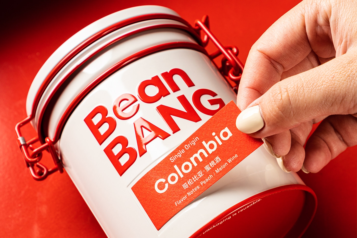


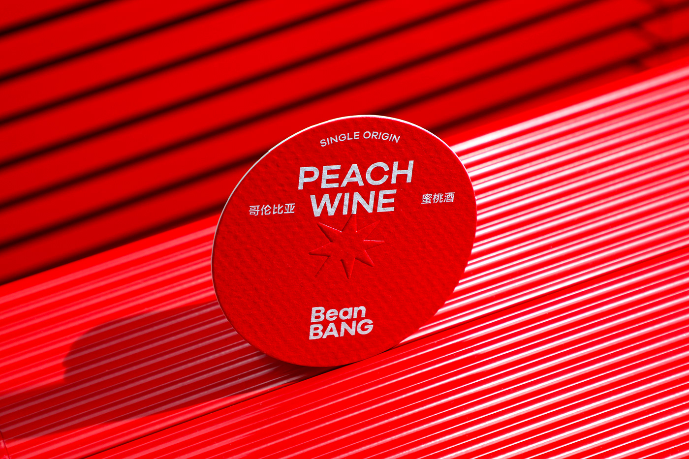
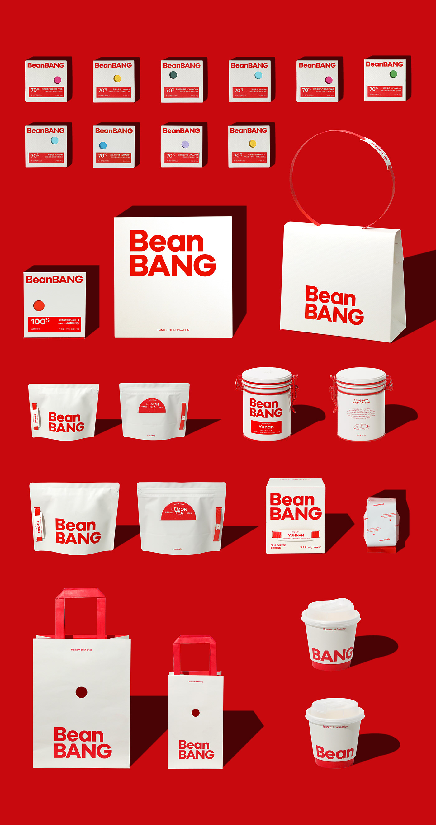
Packaging
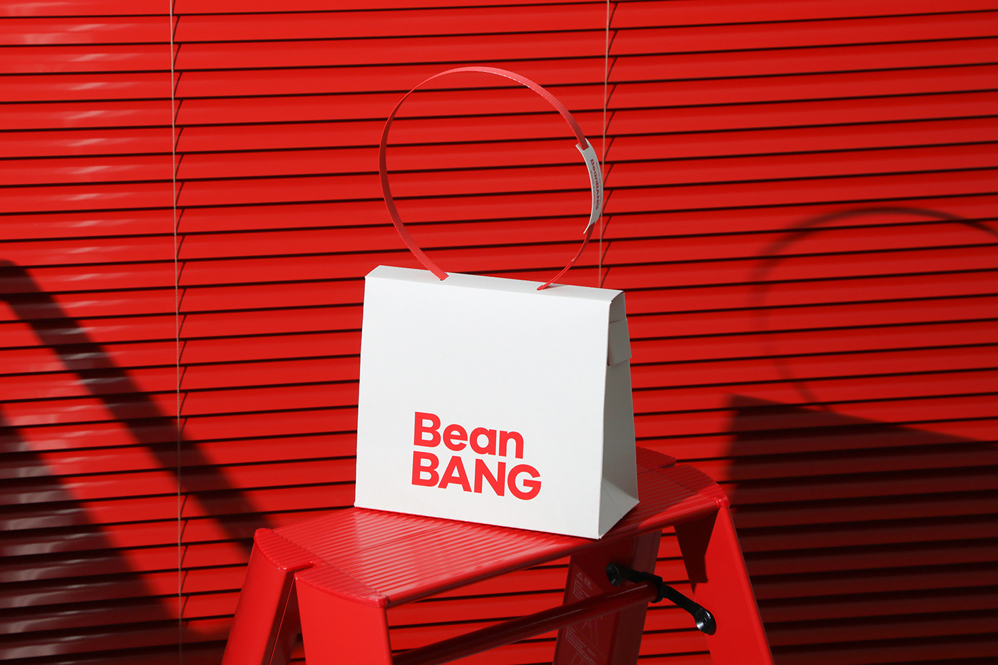
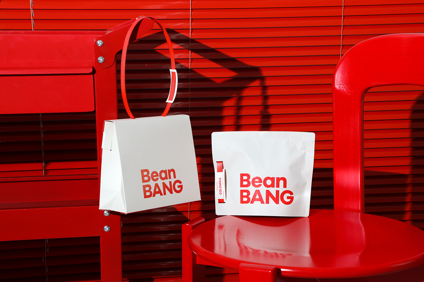
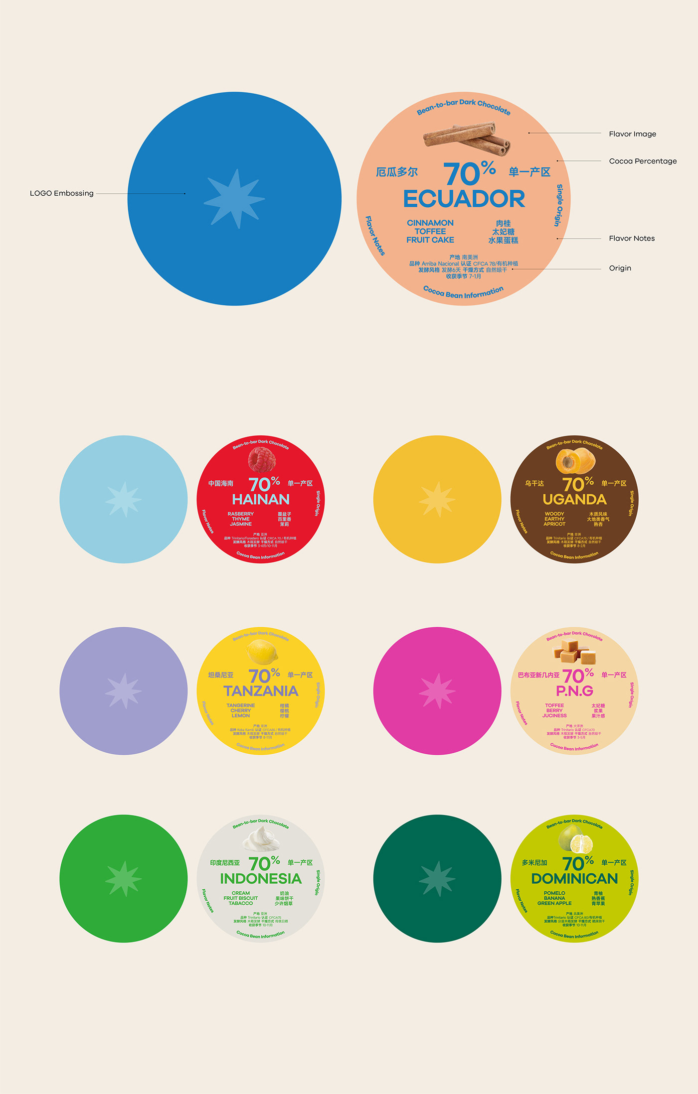
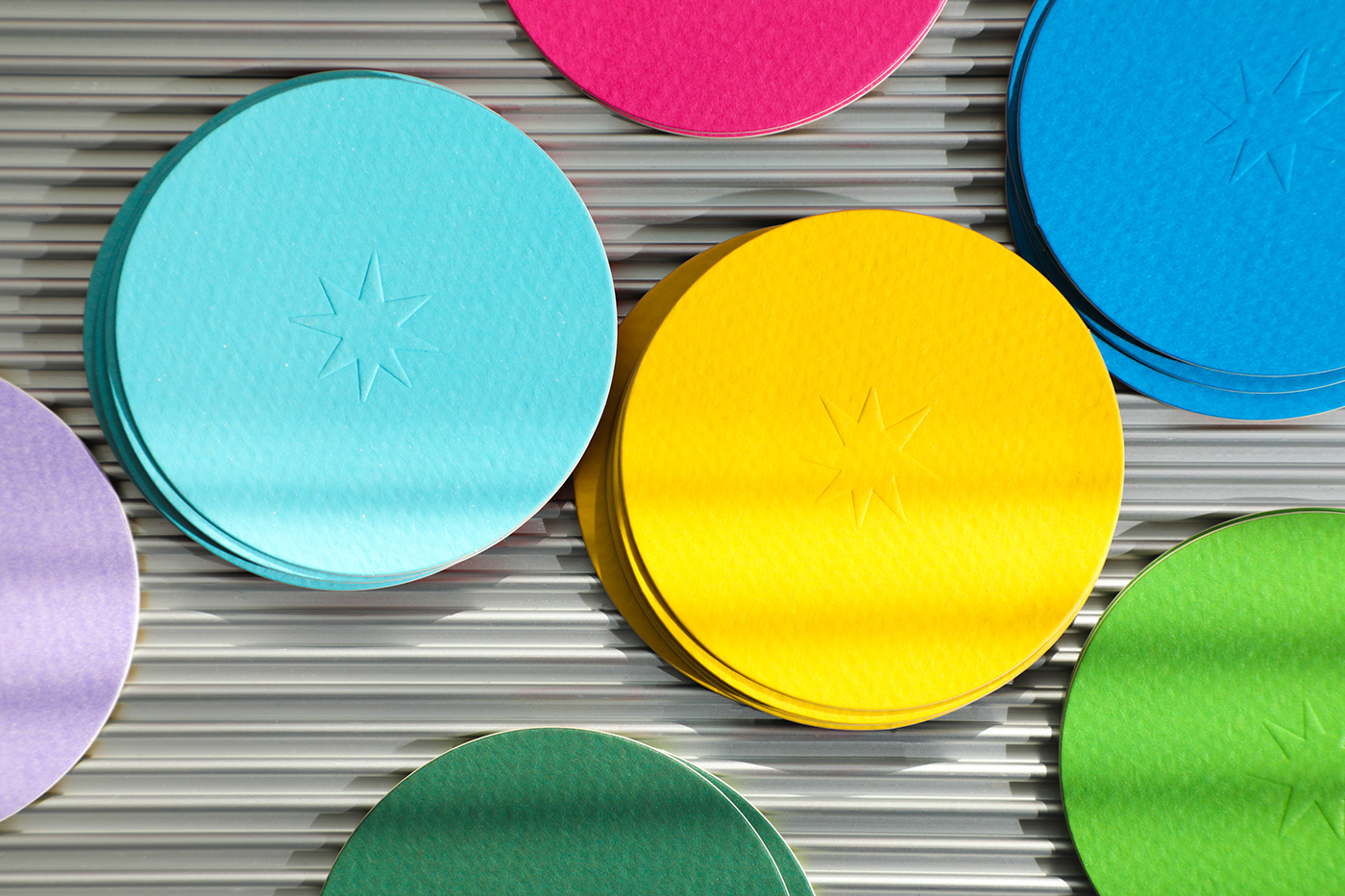
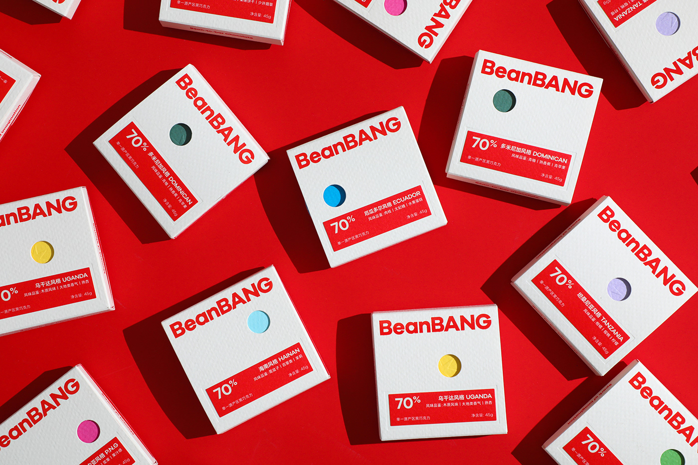
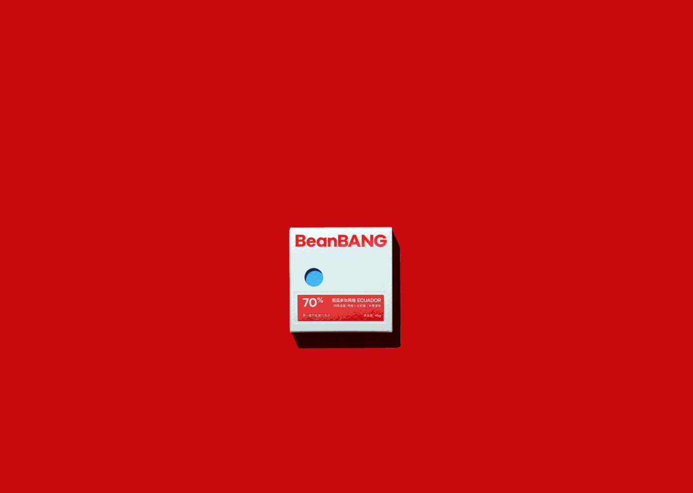
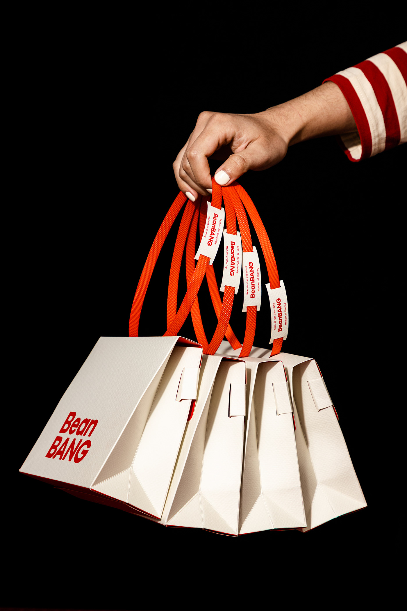
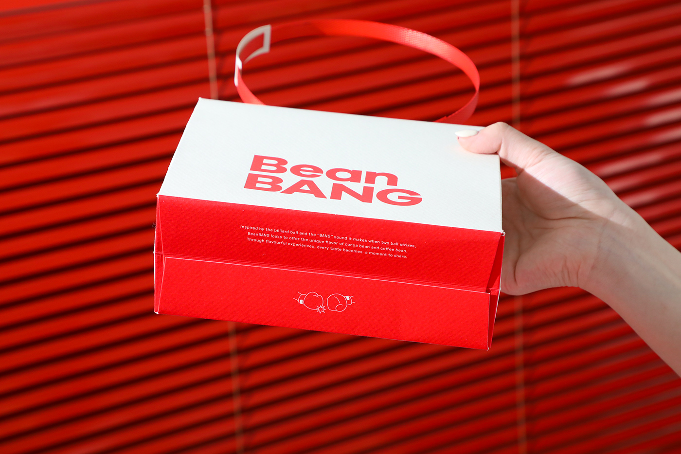
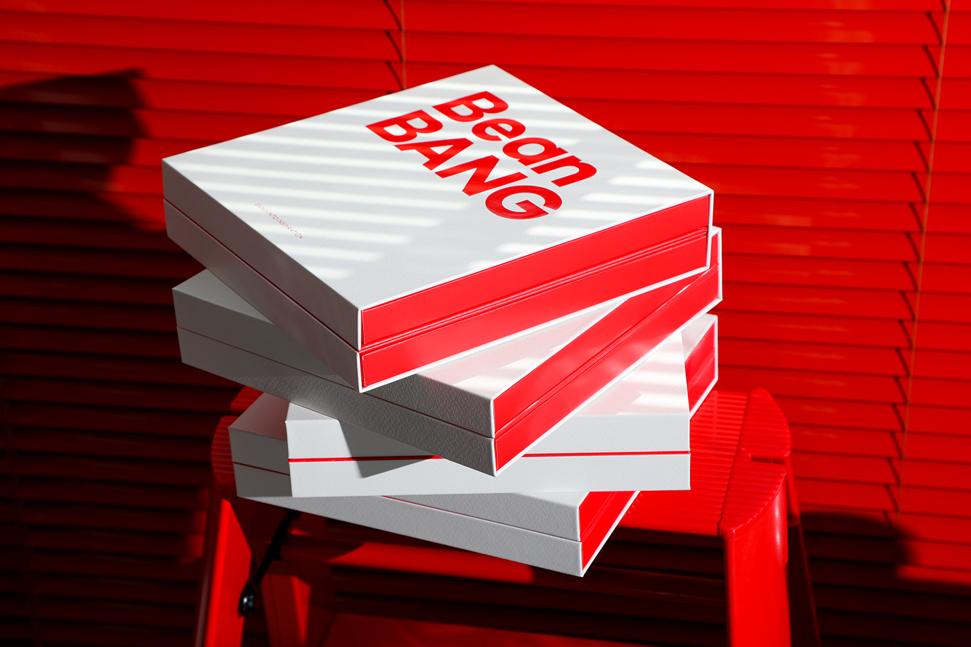
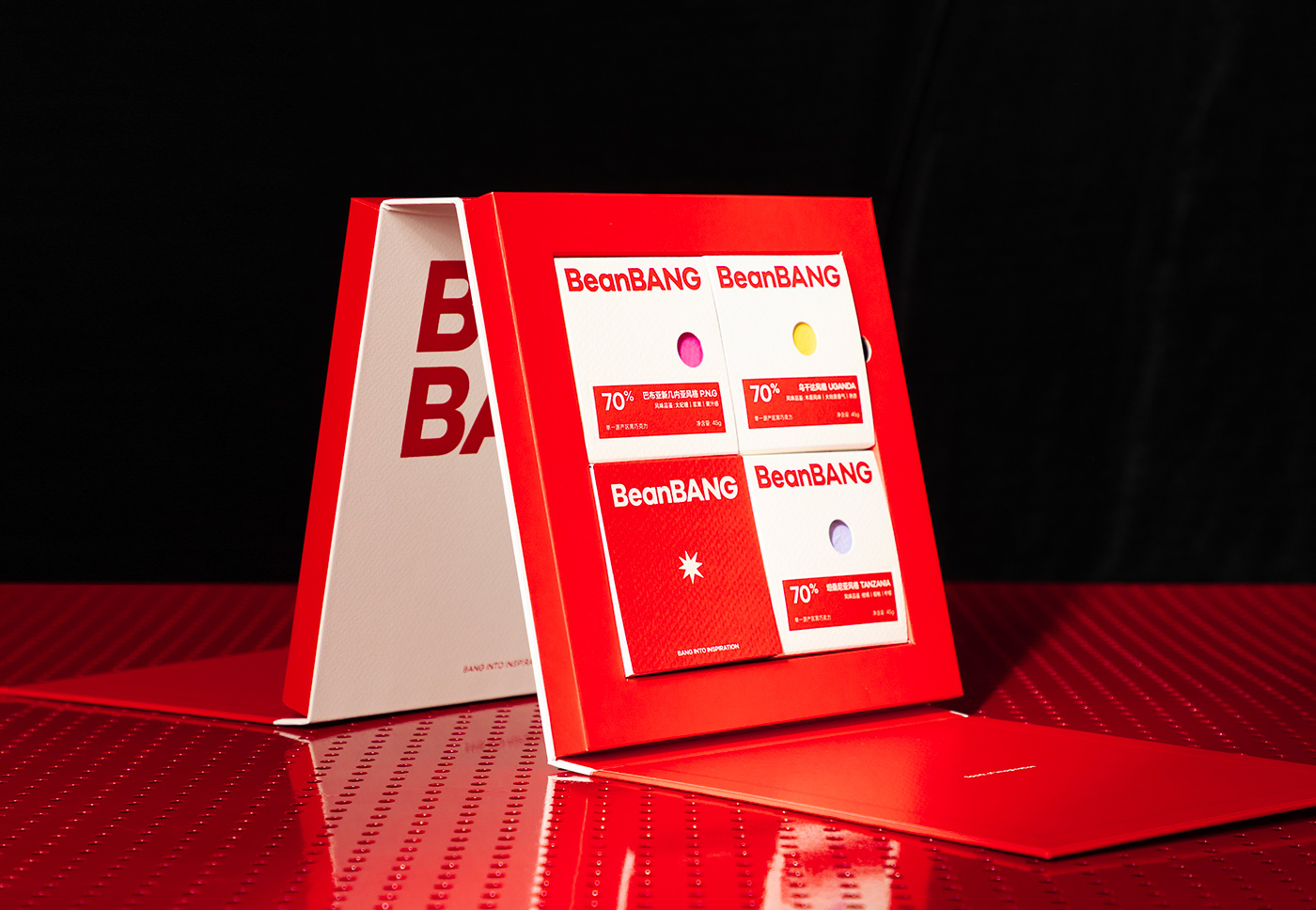
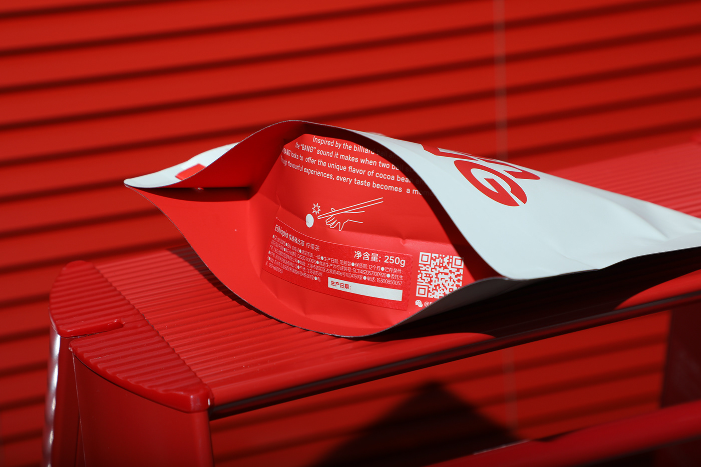
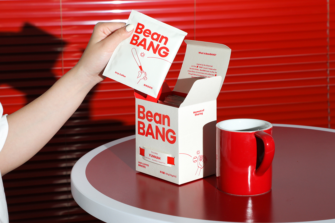
BeanBANG的包装系统分为巧克力和咖啡豆两大包装系统,包装用纸特别选用带有圆点肌理的纸张以凸显品牌风味因子碰撞的概念,明显的肌理触感能够表达品牌从始至终对出品的执着与追求。同时,将粗糙的PP编织带以装饰性的作用与精致的纸张结合,意外碰撞出颇具创造性的视觉效果。
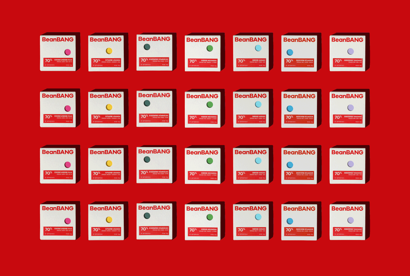
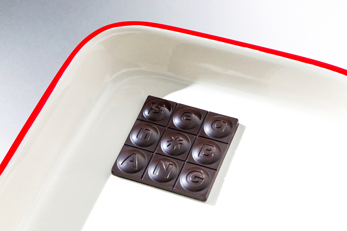
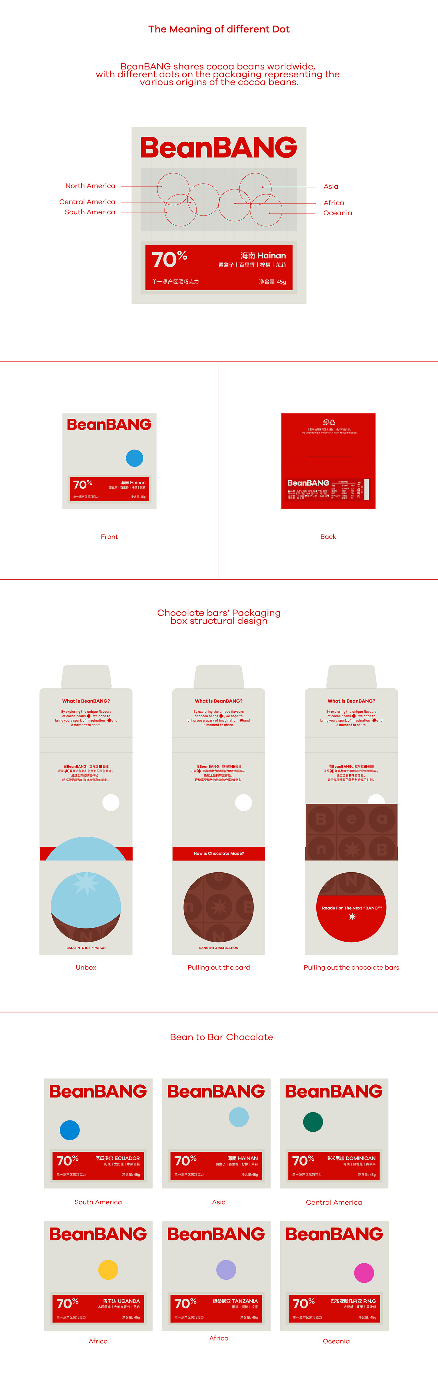
由“圆形分子碰撞”激发灵感,我们将制作巧克力排块的模具设计成凸起的圆形。BeanBANG以产地位置区别产品,希望大家在感受味蕾碰撞的同时,建立可可地图,传播世界可可文化,因此巧克力外包装盒上每一个镂空圆点的位置,均代表着种植可可口的大洲。
The packaging system of BeanBANG is divided into two main branches: chocolate and coffee beans. We chose paper with a dotted texture for packaging to emphasize the concept of 'flavor factor collision' in the brand. The texture expresses the brand's persistence and pursuit of the product. Meanwhile, the combination of rough PP woven straps for decorative purposes with textured paper creates an unexpectedly and creative viusal preception.
Inspired by the concept of 'Circular Collision,' we have designed the molds for chocolate bars with raised circular patterns.BeanBANG shares cocoa beans from around the world, with different dots on the packaging representing the various origins of the cocoa beans.


Design & Photography
low key Design
Yaear
2023
Our graphics open the door for brands to connect with people.


